
An orange dress is undoubtedly a bold and attention-grabbing fashion choice. However, when it comes to pairing it with the right colours, the challenge lies in achieving the perfect balance. If you’re wondering how to style your orange dress, you’ve come to the right place.
This guide explores various colour combinations for orange dresses, helping you understand how to choose complementary colours, accessories, and styles to make your outfit stand out. Let’s dive into the best colour combinations for an orange dress, ensuring you’re ready for any occasion.
Best Colour Combination for Orange Dress
An orange dress offers a unique challenge in styling, but with the right approach, it can become a wardrobe staple that suits a variety of occasions. Whether you’re going for a casual look or dressing up for a night out, pairing your orange dress with the right colour combinations can elevate your outfit to the next level. Below are some of the most stylish and complementary colours to wear with an orange dress.

1. Blue: The Complementary Colour
Orange and blue are complementary colours on the colour wheel. This means that they create a striking contrast when paired together. Whether you’re wearing a bright orange dress or a deeper shade, adding blue accessories or garments to your outfit can enhance its vibrancy. For example, consider pairing an orange dress with a navy blue jacket, teal shoes, or a blue clutch.
Outfit Idea:
- Orange dress
- Navy blue blazer
- Blue pumps or sandals
- Blue statement earrings

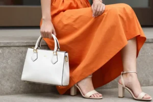
2. White and Beige: Soft and Neutral
If you’re aiming for a softer, more understated look, consider pairing your orange dress with neutral tones like white or beige. These colours complement the boldness of orange without overpowering it. White or beige accessories can add balance and make the orange dress the focal point of your outfit.
Outfit Idea:
- Orange dress
- Beige sandals or pumps
- White handbag
- Gold or silver jewelry
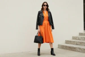
3. Black: Sleek and Sophisticated
Black is a classic colour that goes well with almost any other hue, including orange. Pairing your orange dress with black accessories or shoes creates a sleek, modern look. Black can tone down the intensity of the orange, giving your outfit a more refined and sophisticated appearance.
Outfit Idea:
- Orange dress
- Black leather jacket
- Black ankle boots
- Black handbag
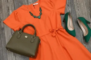
4. Green: A Fresh Contrast
Green and orange are both vibrant colours, but they pair well together when done correctly. A darker green, such as olive or forest green, can create a stunning contrast with a bright orange dress. For a bolder look, try adding a vibrant green accessory like a handbag or scarf.
Outfit Idea:
- Orange dress
- Olive green handbag
- Green heels or flats
- Green statement necklace
5. Gold: Adding a Touch of Luxury
Gold is a luxurious colour that pairs beautifully with an orange dress, especially if you’re attending a formal or evening event. Gold jewelry, shoes, or bags can add a touch of elegance and sophistication to your orange dress. The warm undertones of gold complement the orange, creating a harmonious and glamorous look.
Outfit Idea:
- Orange dress
- Gold jewelry (bracelets, earrings)
- Gold heels or sandals
- Gold clutch bag

Styling Tips for Your Orange Dress
While pairing colours is essential, the right accessories and outfit details can take your look from ordinary to extraordinary. Here are some styling tips to help you make the most of your orange dress:
1. Add Textures
Mixing textures can elevate your outfit and add visual interest. For example, pairing an orange dress with a denim jacket, leather boots, or a velvet handbag can create a rich, layered look. Mixing materials like cotton, leather, and silk helps break up the boldness of the orange dress while adding sophistication.
2. Use Colour Blocking
Colour blocking is a fashion technique that involves pairing bold, contrasting colours in one outfit. For an orange dress, consider pairing it with contrasting colours like blue, black, or white in solid blocks. This technique can make your look more dynamic and stylish.
3. Experiment with Accessories
Accessories can play a huge role in enhancing your orange dress. Consider experimenting with hats, scarves, glasses,belts, and shoes in complementary or contrasting colours. Accessories not only help complete your look but also allow you to express your personal style.
Accessory Ideas:
- A teal or navy blue scarf
- A chunky gold necklace
- A statement handbag in neutral tones
- Bright-coloured earrings for a pop of contrast
Comparison Table: Colour Combination for Orange Dress
| Colour Combination | Description | Best For |
|---|---|---|
| Orange + Blue | Complementary colours that create bold contrast. | Casual and evening wear |
| Orange + White/Beige | Soft, neutral shades that balance the orange. | Daytime and casual outings |
| Orange + Black | Elegant and sleek, adds sophistication. | Formal events and evening wear |
| Orange + Green | Fresh contrast, especially with deeper greens. | Bold, creative outfits |
| Orange + Gold | Luxurious and elegant, perfect for glam. | Evening events and special occasions |
Trending FAQs About Colour Combination for Orange Dress
Q1: What colour goes with an orange dress for a wedding?
For a wedding, you want to keep things elegant yet stylish. Consider pairing your orange dress with neutral tones like beige or soft white. You could also go for metallic tones like gold or silver for a touch of glamour.
Q2: Can I wear an orange dress with red?
While red and orange are both warm tones, they are adjacent on the colour wheel, meaning they can clash if not styled correctly. To avoid overwhelming the outfit, keep the red elements subtle, such as red shoes or a small handbag.
Q3: What colour shoes should I wear with an orange dress?
The best shoe colour to pair with an orange dress depends on the look you’re going for. For a bold contrast, go with blue or black shoes. For a softer look, opt for beige, white, or metallic shoes.
Q4: Can I wear a green accessory with an orange dress?
Absolutely! Green and orange make a striking combination, and using a green accessory like a handbag or scarf can add a refreshing contrast to your orange dress. Darker greens like olive or forest green work particularly well.
Q5: How do I wear an orange dress for a formal event?
For a formal event, consider pairing your orange dress with a black or navy blazer. Add gold or silver jewelry to elevate the look, and choose a sophisticated pair of heels. A simple clutch will complement your outfit without overpowering it.
Conclusion
An orange dress offers countless styling opportunities when paired with the right colours. Whether you’re aiming for a bold, contrasting look with blue or opting for something more subdued with beige, understanding the best colour combinations for your orange dress can help you create an outfit that perfectly suits your style.
By experimenting with accessories, textures, and colour schemes, you can create versatile looks that transition effortlessly from day to night. Keep these tips and ideas in mind, and you’ll be ready to rock your orange dress in any setting.